My Happy Place

Did you view the Journal Page tutorial using Gel Press yesterday? Well today, we have used the remaining pieces with the same colours lifted in yesterday’s video and created a completely different page. This one is with elements, depth and dimension.

April Scrap n Pieces 1April Scrap n Pieces 2April Scrap n Pieces 3April Scrap n Pieces 4April Scrap n Pieces 5

We were inspired by :

The Moodboard at Scrap n Pieces for the April Challenge– “My Favorite Things” for us is ‘My Happy Place’- being in nature, with flowers blooming, birds chirping and butterflies flying. We were also inspired by the colour palette and the various textures on the board.

Crafter’s Castle April Challenge– For us Dimension is in the form of all elements against each other, adding depth and giving the real feel.

Here’s the link to the tutorial in case you missed it:


A night by the Sea

Come join us for a drink by the sea, under the stars glistening and the moonlight dancing like diamonds on the crystal clear water, bringing waves ashore! An experience to leave you in awe of life and in peace with your inner self.

Today we’re back with our latest mixed media work. We were inspired by the Stage 2 of the Creative Art Joint Project at Mixed Media and Art- Crystal Beauty.

creative2bart1

And what have we created? These wives glasses! Yes, we altered two wine glasses for our transparent object. Our glass base is circular, and we also added a few circular shells as well as pearls to incorporate the challenge theme. We’ve used a lot of Prima Marketing and Finnabair products- Color Bloom Sprays, Art Alchemy Paints, Impasto Paints and Waxes.

Here’s a look at our project:

IMG_2950IMG_2947IMG_2969IMG_2978IMG_2977IMG_2976IMG_2973IMG_2975IMG_2951IMG_2952IMG_2954IMG_2963

Autumn Love

We’re back with another layout and this time we were inspired by the board at Cuts2Luv October Challenge

cutsoct17ang

In our Layout, we’ve used the Wooden Pattern as our background paper; autumn trees in our focal photo; leaves as our embellishments and the colour combo. To top it all we also followed the sketch! We’ve not given a particular title to this one, as we thought the photo and the Cuts2Luv badge did justice to our layout!

Here’s a look at it:

Cuts2Luv Oct 1Cuts2Luv Oct2Cuts2Luv Oct3Cuts2Luv Oct4Cuts2Luv Oct5Cuts2Luv Oct6Cuts2Luv Oct7

Be Brave Tag 

Hello,
Today we’re back with a mixed media tag. 

We were inspired by Lindy’s Color Challenge and have used the September Color Challenge Mega Kit for our tag. The colours in this set include Sprays: Orange Creamsicle, Golden Doubloons, Delphinium Turquoise, Cathedral Pines Olive, Sandra Dee Sepia; Embossing Powders: Orange Creamsicle, Caesar’s Gold, Guten Tag Teal, Tannenbaum Green Gold and Bratwurst Brown


Here’s a look at our tag

School Postcard

Today we’ve created a postcard as a wish to a teacher for Teacher’s Day. We’ve used the collage technique to inspire you with the Happy Little Stampers Challenge theme. We’ve incorporated the words school and play (school as our theme and play of colors) to inspire you with the challenge at Colorful Creations. We’ve incorporated the theme of School Fun with a twist of books to inspire you with the Mixed Media Mojo Challenge!

Do drop by and participate in these challenges!

CC Sept +HLS + MMM 3CC Sept +HLS + MMM 2HLS Sept

We have a video tutorial for this one:

Oceania

The International Tournament of Art & Craft Challenge is really getting us to push our limits and go beyond the usual.

The Challenge 3 Oceania was not only about creating but also about reading and going into the history.

We’ve created a canvas incorporating various elements and mediums.

  • Patterns inspired by traditional symbols – we worked with lines and Aboriginal forms.

  • Think Monochromatic black and white or think colors of the Earth- We’ve worked with the classic black and white and the colors representing the five elements that come together to form our world/planet. (Wind, Fire, Water, Wood, Metal)

  • Some sort of organic or natural material(s)- We’ve worked on jute as our base for the canvas.

  • Shapes inspired by traditional or indigenous art-  Basic geometry and we’ve incorporated ambiguity in our piece.

Here’s a look at the canvas:

Oceanic 1a

Oceanic 1bOceanic 1cOceanic 1d


Favourite Artist

Well, today we’re here with an interesting creation! We were inspired by the Canvas Corp Brands August Challenge- Let’s Visit the Cinema (#ccbchallenge) (our LO revolves around a music composer, playback singer, and actor of the Indian Cinema) and the 7 Dots Studio Challenge Favorite Artist (Our favorite artist from Indian Cinema).

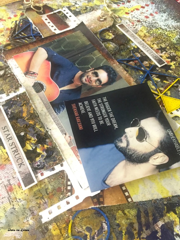
Our creation revolves around Shekhar Ravjiani, the famous music composer from the duo Vishal-Shekhar. He is an amazing singer and has sung songs in several Indian languages, and different genres. He has also acted in the film Neerja! He is an inspiration, and we can listen to his songs on the repeat playlist zillions of times (including his devotional songs).

Recently, he has launched a single ‘Devi’, a tribute to daughters/women. We have immense respect for him and when we saw these two challenges we couldn’t help but create a layout with him!

Now we are such huge fans, that we couldn’t stop at one layout; so we decided to create two :)!

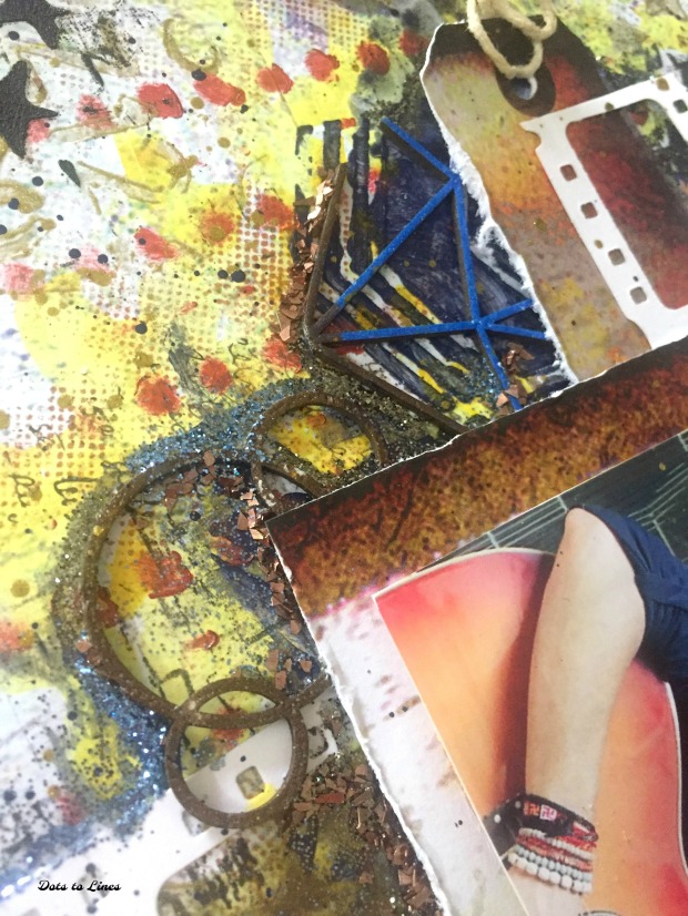
For both are layouts we used the 7 Dots Studio Hazy Days Collection, Art Alchemy Paints, Lindy’s Sprays, Papericious Chippies, Sizzix Die, Art Ingredients glitter. Same materials and two different projects!

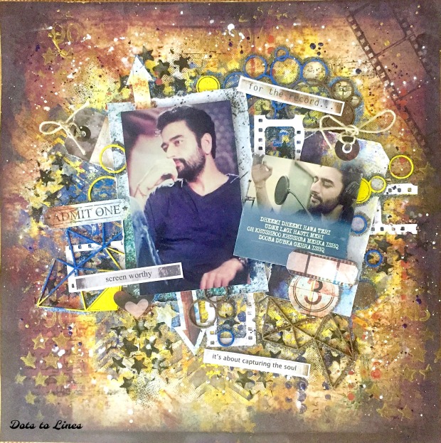
Here’s the first one:

The lyrics are from a song Gehra Ishq from Neerja and here’s an English translation-

“in your light breeze,
my existence has begun to fly away.
this fragrant love, that is all fragrance
this submerged-immersed, deep love.”

Shekhar LO 1a

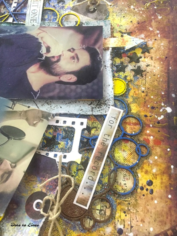
Here are some close ups:

Shekhar LO 1bShekhar LO 1c


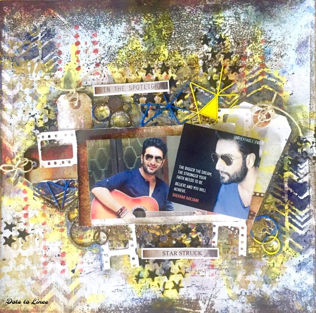
Here’s our second layout:

“The bigger the dream, the stronger your faith needs to be. Believe and you will achieve.”- Shekhar Ravjiani

Shekhar LO 2aShekhar LO 2bShekhar LO 2c

These layouts were submitted for:

Canvas Corp Brands August Challenge- Let’s Visit the Cinema (#ccbchallenge)

7 Dots Studio Challenge Favorite Artist

Asia- India

Today we’re travelling to the continent of Asia as a part of The International Tournament of Art & Craft Challenge 2.

The themes, elements and the board for this challenge are so vibrant and fun to work with. Since we are from India, we thought of showcasing that as a part of Asia in our layout today.

Itac 2 

Here’s how we’ve interpreted the challenge:

Our layout is an Indian Wedding Celebration with all the rich and luscious colours- Orange, Magenta, Purple, Fuschia and Gold. Our background consists of a border on the top, all done with stamping and incorporating motifs to represent a traditional Saree border (saree being a traditional Indian attire). We’ve added textures with a mandala stencil and worked our focal picture and layering around that. Our elements include mandalas, flowers, geometric flowers, leaves, and other motifs. We’ve also added some hand shaped flowers and leaves for dimension as well as a realistic touch. For our colours, we’ve played with pigment powders and inks.  Our layout not only represents the Saree border, but also a Mantap- which is the auspicious place of a wedding where the couple takes their vows.  Hence our elements, further add to the real feel of a Mantap.

  • Motifs inspired by mandalas- We’ve used Indian Motifs as well as Mandala motifs in our background as well as layering
  • Geometric shapes- We’ve used geometric flowers and leaves in our layering
  • Tiles – Ceramic, pantiles, glazed tiles, or their designs- We’ve used the doodling/free flow designs in our background and layering elements
  • Asiatic flowers, such as cherry blossom, chrysanthemum, orchids, lotus, Frangipani, lilies, hibiscus etc- We’ve used the Frangipani also known as Plumeria and Lillies in our layering, our background border has the Lotus
  • Calligraphy or handwriting- Our title is handwritten
  • Fabric, faded or dyed- Not used
  • Powdered pigments- We’ve used our pigment powders for colours in our background.We also used them to colour a few layering elements.

Here’s a look at our layout:

Asia 1Asia3Asia6Asia5Asia4Asia8Asia9


I have a dream, a song to sing…

Today we’ve created a layout inspired by the Papericious August Challenge Mood BoardMore Than Words August Challenge and Mixed Media World Challenge.

We were inspired by the bright vibrant colours, butterflies, sequins and dream catcher from the Papericious Mood Board.

For the More Than Words Challenge, we’ve portrayed Harmony in the world around us, in nature and how everything comes together. We were inspired by the song “I have a dream” from Westlife. This song further emphasises on the fact that we all have dreams and sometimes it’s all things around us that come in harmony to fulfil these dreams.

We were inspired by the beauty in nature and the colours from the Mixed Media World Board.

We’ve used a lot of Papericious mediums and mixed media products for this one. All the supplies are listed at the end of this post.

Here’s a look at our layout:

Papericious August 2Papericious August 3Papericious AugustPapericious August 8Papericious August 7Papericious August 6Papericious August 4

Supply List:

  • Papericious Fairyland Paper Pack and Indie Chic Die Cut elements
  • Papericious Heavy Gesso White
  • Papericious Chippies- Butterfly and Dream Catcher
  • Papericious Dots Acrylic- Moon Yellow
  • Papericious Spritz Sprays- Tangerine Tango, Martian Green, Ocean Blue, Baby Pink
  • Papericious- Rajni Chawla’s Crytal Clear Powder
  • Papericious Sequins mix- Spring
  • CraftTreat Stencil- Marble
  • Distress ink- Vintage photo
  • Finnabair Stencil- Dots & Stripes
  • Finnabair Stamp- Messy Script, Bubbles
  • Archival Ink -Jet Black
  • Art Basics- 3 D Matte Gel
  • Fevicol
  • Foam Tape

This was project was submitted for:

Papericious August Challenge Mood Board

More Than Words August Challenge

Mixed Media World Challenge