The Altenew June Inspiration Challenge palette surely has my heart. There is something about putting together pink, purple and green. I’ve gone all out and made so many cards with this palette and they are all different and unique in their own way!
Here’s a look at the card:
I’ve stamped the Painted Flowers blooms and leaves using Shades of Purple and Spring Bouquet Inks, and die cut them. On the card base, I applied Paper Glitz through the Spring Garden Stencil. I stamped the sentiment with Obsidian Ink. I glued the sentiment and the floral clusters anchoring it.
The Altenew June Inspiration Challenge palette surely has my heart. There is something about putting together pink, purple and green. I’ve gone all out and made so many cards with this palette and they are all different and unique in their own way!
Here’s a look at the card:
I’ve stamped the Majestic bloom flower and leaves using Shades of Purple and Spring Bouquet Inks, and die cut them. On the card base, I blended pink through the Spring Garden Stencil. I stamped and heat set the sentiment on vellum and fussy cut around it. I adhered the flowers with foam tape for depth and dimension. I completed the card with clear sequins. I also made a coordinated envelope for the card.
The Altenew June Inspiration Challenge palette surely has my heart. There is something about putting together pink, purple and green. I’ve gone all out and made so many cards with this palette and they are all different and unique in their own way!
Here’s a look at the card:
I’ve stamped the Painted Flowers blooms and leaves using Shades of Purple and Spring Bouquet Inks, and die cut them. On the card base, I blended lime ink to create a halo and glued a floral cluster over it. I stamped and heat set the sentiment on vellum and add the strip. I completed the card with enamel dots.
Today I’m sharing a dimensional layered card. I’ve mixed up several techniques on this one, and for me it qualifies as a mixed media card.
I was inspired by techniques shared in the Altenew, 3D Floral Focus, a class I chose for Level 3 certification. Apart from various ways to use the layering dies, I particularly loved combining them with coordinating stamps. This stayed with me, and I’ve used it on my card. I also created custom cardstock with watercolours and I love the particular velvet finish I achieved for the die cut peony flower.
Here’s a look at my card:
I have an Instagram Reel, sharing how I coloured and created the Open Peony Layered Flower. Check that here.
I used the Peony Bouquet Layered stamp set with inks in similar colours, and stamped several of the big flower, the buds and leaves. I used extra foliage from Golden Garden Stamp. I used Clear Sparkle embossing powder to heat emboss the outline layers on the flowers.
For the card panel, I’ve used Neena Solar 80 pd White cardstock and added score lines at every 1/4″ to create a texture. I splatted the ink colours to create movement throughout.
Once happy with my floral arrangement (I had in mind one of those hand held bouquets), I completed the card with a sentiment and white sequins. I did use foam sheet underneath the panel when gluing to the card base, for further dimension.
For the colours I was inspired by the June Inspiration Challenge. And I’m submitting this card for the same as well.
Today I have a long post to share. I have created a set of 5 masculine cards along with a gift box and an altered storage pouch as part of my final submission for Altenew Educator’s Certification Program, Level 2.
The first part of the challenge was to create a set of 4 Masculine cards (Anniversary, Birthday, Love and Encouragement), inspired by the classes from Level 1 and 2. The second part was to upcycle/recycle and create an altered project.
Here’s a look at the cards:
I have a video tutorial for all the cards I’ve created over on YouTube. Scroll below for the video tutorial. I created an extra card simply because I had scraps left, and Father’s day is approach. In the flow of creating masculine cards, I thought it was perfect timing to get that done as well.
Before I go into the details, I want to talk about the three classes/components I was inspired by:
Ink Blending Techniques- I incorporated techniques of simple ink blending for extra touch on cards, ink blending to create custom cardstock, ink blending and creating a cloudy look with splatters, using inks as watercolours, resist embossing with inks. Creative watercolor media was another class that helped me stretch my inks and using them for the cards.
Color Your Day and In the mood for Colour – these classes helped me create cards with intention for the occasion. Knowing the mood I wanted to create, I was able to pick the colours, use the 70-20-10 ratio for balance ensuring I have clean spaces.
Clean & Simple Boutique Cards- creating simple and effective cards with minimal element stamping, repetitive stamping, leaving clean spaces, balancing the elements. I also helped me stretch my supplies, use the same ones in different ways.
Handy Tips
I’m sharing a few tips with you’ll that helped me creating these cards:
When working on a set, begin with one element that can be repeated across the set to tie them together. I chose a colour palette for this. Pinterest has several colour palettes to be inspired from. I also like to go through my inks and pick a palette.
Repeat a stencil or stamp, and use it in a different way on multiple cards. The similarity again, brings cohesiveness.
Pick a few supplies and stretch them when creating. I picked 2 stamps, 1 stencil, 1 ink set and used them in a variety of ways.
When using inks as watercolours, keep card panels or extra watercolour cardstock pieces handy to pick any left over colour. These can be used for a later card/project.
When fussy cutting an image, outline it with a pencil leaving a narrow border. This makes. it easy to cut, and creates a shadow.
When working with embossing powder, prep the cardstock with anti-static powder. I simply use a sock filled with baby powder for this. The lint roller comes handy in picking away powder residue and clean the desk when working with embossing powders.
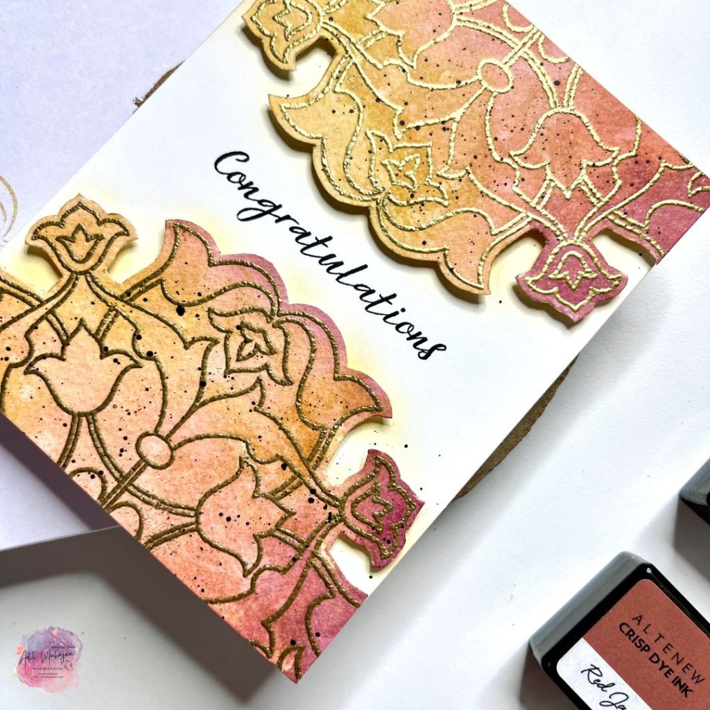
Card 1
For the first card, I’ve used the geometric pattern to create a ‘Congratulations’ card that can be used for an anniversary or any other celebration. I began by smooshing inks(raw amber, red jasper and rhodolite) on the craft mat and painting with them onto misted watercolour paper to create a coloured background. I then stamped the image from the Arabesque Medallion stamp set and heat set it with Gold Embossing Powder. I cut the pattern in half. On the card base, I ink blended with the yellow subtly around the edge of the design. I used foam squares to uproot the stamped design as a mirror image on the top and bottom of the card panel. I stamped the sentiment with Obsidian in the middle and completed the card with black splatter. I created a coordinated envelope by stamping the same design with Gold ink.
Card 2
For the next card, I continued to play with the inks like water colours. I also continued with the theme of geometric pattern and created a ‘Love’ card. On a piece of watercolour paper, I applied embossing ink through a stencil and heat set it with white embossing powder. This created a resist effect. The pattern of my stencil is like multiple diamond clusters. I coloured them one cluster at a time, painting with the inks (raw amber, tanzanite and green opal). I then outlined the clusters with a black fine tip pen. I cut along the clusters to create interest on the panel. I adhered it to the card base. Stamped two sentiments to create a cluster and completed it with sequins. For the coordinated envelope, I blended the same inks through the stencil to repeat the pattern.
Card 3
For my next card, I decided to use the little scrap of coloured paper remaining from the previous card. This decided to change the orientation to vertical and create a Father’s Day Card. I used the paper as a base for my other elements, creating this illusion of a table top. I stamped elements from the Best Dad stamp set, and coloured them with Artist Markers. I fussy cut these for my focal elements. On the card panel, I ink blended with Raw Amber, Green Onyx and Tanzanite, on the lower half. I then used the same stencil and rubbed a baby wipe over it to lift off some colour, creating a muted texture. I used foam tape as well as liquid glue and adhered the elements. I used two sentiments from the same stamp set to complete the card. I stamped the best dad cup on the envelope to coordinate it with the card.
Card 4
For the next card, I played with the technique of ink blending. I created a scenic card for a birthday. I first blended Tanzanite ink on a piece of cardstock. Once dry I stamped a skyline image from Sketchy Cities with embossing ink and heat set that with gold embossing powder. I fussy cut along the outline of the image and set it aside. On my card base, I blended inks-Raw Amber, Red Gasper and Rhodolite to create a sunset sky. I left a little area on the top, white. I then splattered clean water and bloted that. I splattered the same ink colours as well for more interest. At the bottom of the panel, I ink blended with Tanzanite and stamped the same sky line image with Silver Lake ink to create a reflection. I used foam tape to adhere the embossed sky line and completed the card with a sentiment for the same stamp set. I stamped the same skyline with Tanzanite ink on the envelop to coordinate it with the card.
Card 5
My last card is an encouragement card. Since it’s a masculine card, I tried making this funny with the images I chose. I picked out elements from the best dad set that directly show strength (the weight and hammer), as well as the gameboy, to make it funny. I stamped the elements repeatedly with Jet black ink. While do so, I made sure to have them over hang at the edges to create a sense of continuity and movement. I also created a mix in terms of their orientation-horizontal and vertical. I then used all the inks in the Jewel Tones Set and watercoloured the images. The idea was to add colour and not focus so much on shading. I then stamped a few stars in between the elements to fill the space. I mounted the white panel on black cardstock and adhered it onto a white card base. I stamped a sentiment from Bamboo Rose Set, and trimmed it like a banner. I add a piece of black cardstock underneath that as well to match with the card. I completed the card with enamel dots. I stamped a few elements on the envelope to match it with my card. I simple love the colourful positive vibe of this card.
Video Tutorial
Altered Project
For the second part of the challenge, I was to recycle/upcycle and create an altered project. I decided to do both and create two projects.
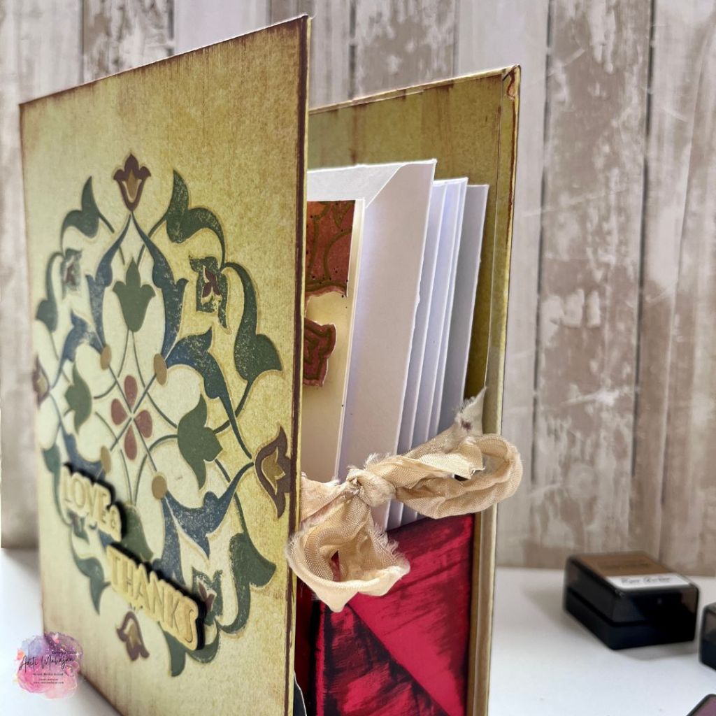
Gift Box- Recycled
I recycled and created a gift box for my cards. I wanted to create a grungy rustic box, keeping in sync with the cards I created and the Jewel Tone Inks.
For this, I re-cycled a coffee sachet carton. I cut one box into half, and used the bottom half. I wrapped that with an H&M gift bag, quite like wrapping a present. I then used cardboard pieces from my stash, to create the outer box. I covered it with pattern paper from an old Reflections Scrapbook Kit from Altenew. I chose mustard since it matched with the ink. I then rubbed a few inks directly on the boxes, creating this woodgrain grungy texture. I stamped and fussy cut the skyline image and added it on the inside. For the outside of the box, I used the Arabesque Medallion pattern stamp, and stamped all its layers, using all the inks in the Jewel Tones Set. I used inks and a stencil on spine for texture. I completed it with a sentiment from the Streamlined Set, to create a cohesive gift set.
Coffee Carton, H&M Gift Bag
Storage Pouch- Upcycled
For my second Altered Project, I wanted to try something new and different. I decided to paint a plain off-white storage pouch. This was a huge experiment, working with stamps, watercolours and inks on cotton fabric. I was so thrilled with the idea I had, that I had to give it a go. I played with slightly different techniques on both the sides of the pouch to see how cotton fabric responds to a variety of products.
Here’s a look at the two sides of my pouch:
I am beyond thrilled with the result and want to decorate more such pouches. I have used the 36 Pan set watercolours to give a light wash of colours (Pink Diamond, Cotton Candy, Warm Sunshine and Bamboo). On the side with the phrase- Be your own kind of beautiful, I used the outline stamp from beautiful day and stamped the flower with Cotton Candy and Sunkissed inks, and the leaf with Bamboo. I then used the same watercolours along with brush markers- Sunkissed, Purple Wine, Lime and Sweet Leaf to colour the flowers and leafs. I also used the Fresh Dye Ink Coral Red to stamp foliage around. I then used a black and white fine tip pen to doodle and create artistic flowers. I completed it with a sentiment, splatter and 3D outlines in black for more details. This gave me a nice loose watercolour vibe.
On the reverse side, after a light water colour wash, I stamped the flowers and leaves using the detailed stamp layers without the outline. I used inks from the Red cosmos set, Pretty in Peach and Summer Sherbet. Once I stamped the flowers and leaves, I used my water brush to blend the inks and mimic a watercolour look. The rest of the stamps where same ass before. This gave me a watercolour look, with the flowers more defined in terms of colour shading.
I personally love both the looks and am surely going to build on this. I have incorporated a variety of lessons from Beautiful Details, Layering Stamps, Creative Watercolor Media and other classes.
That brings me to the end of this long post, I really hope you’ve enjoyed every part of this as much as I have creating it.
Starting today we have an Instagram Hop, a collaboration between WOW Embossing and LDRS. I have created a TN Layout. Check out all the hop details here.
Today I’m sharing a card inspired by the techniques I learn during the Magical Marker Techniques Class, part of the Altenew Educators Certification Program, Level 2. I love that this class is an introduction to using alcohol markers in a fun way.
Here’s a look at my card:
For my card today, I used the markers in two ways- one to add accent to my card with striped and second by scribbling with a marker onto the craft mat, dropping rubbing alcohol. lifting the colour with acetate and smooshing it on my card base of a subtle textured background.
I’ve used inks in the same colour as my markers, and created the floral cluster by repeated stamping. I like such cards, these are quick and easy to make and come handy when making multiple cards. Depending on the colours, they can be used for any gender.
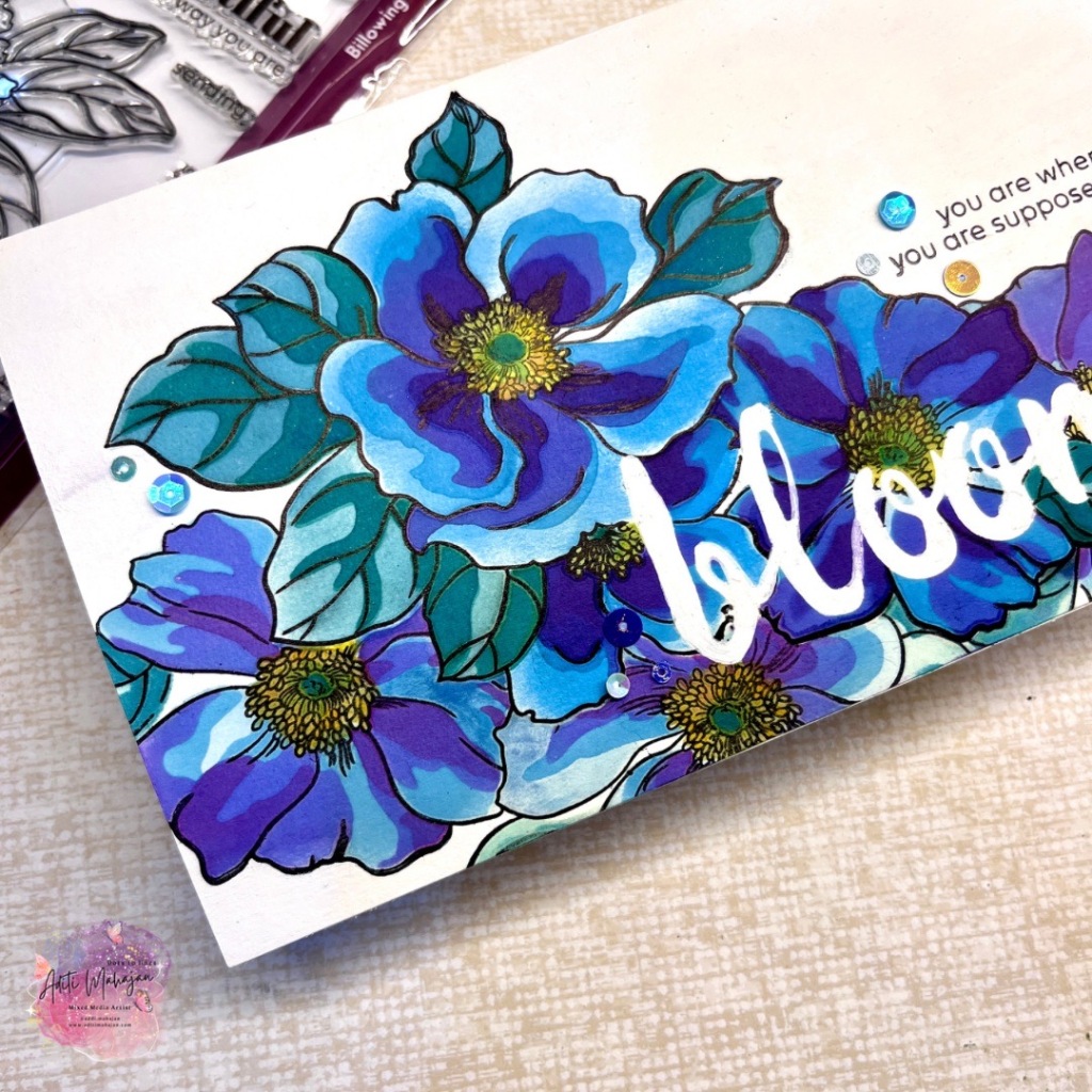
Today I’m sharing a card filled with masking layers, creating a flower bouquet. I’ve never been a fan of masking, simply because of the effort that it takes to create masks. However, after taking the Masking Unleashed Class, a part of Altenew’s Educators Certification Program, I’ve fallen in love with the technique. I learnt the ability to create depth and illusion in a single flat layer with masking. The tips and tricks shared in the class have been insightful and I’m glad I’m hooked onto this technique now.
Here’s a look at my card:
I have used the smaller flower cluster from the Billowing Peonies Set for this card. The blooming flowers inspired me to use the word- bloom for my sentiment and masking it. I’ve used the calligraphy alpha word die to mask the word.
I began by stamping and colouring the cluster with coordinating stencils and inks. I kept this cluster more blue with a tinge of violet. I then masked the entire cluster and stamped another layer behind. I kept these flowers a lighter tint of blue with more violet, differentiating them from the main cluster. This created depth, illusion and variety in my bouquet. I completed it with another sentiment from the set and some sequins.
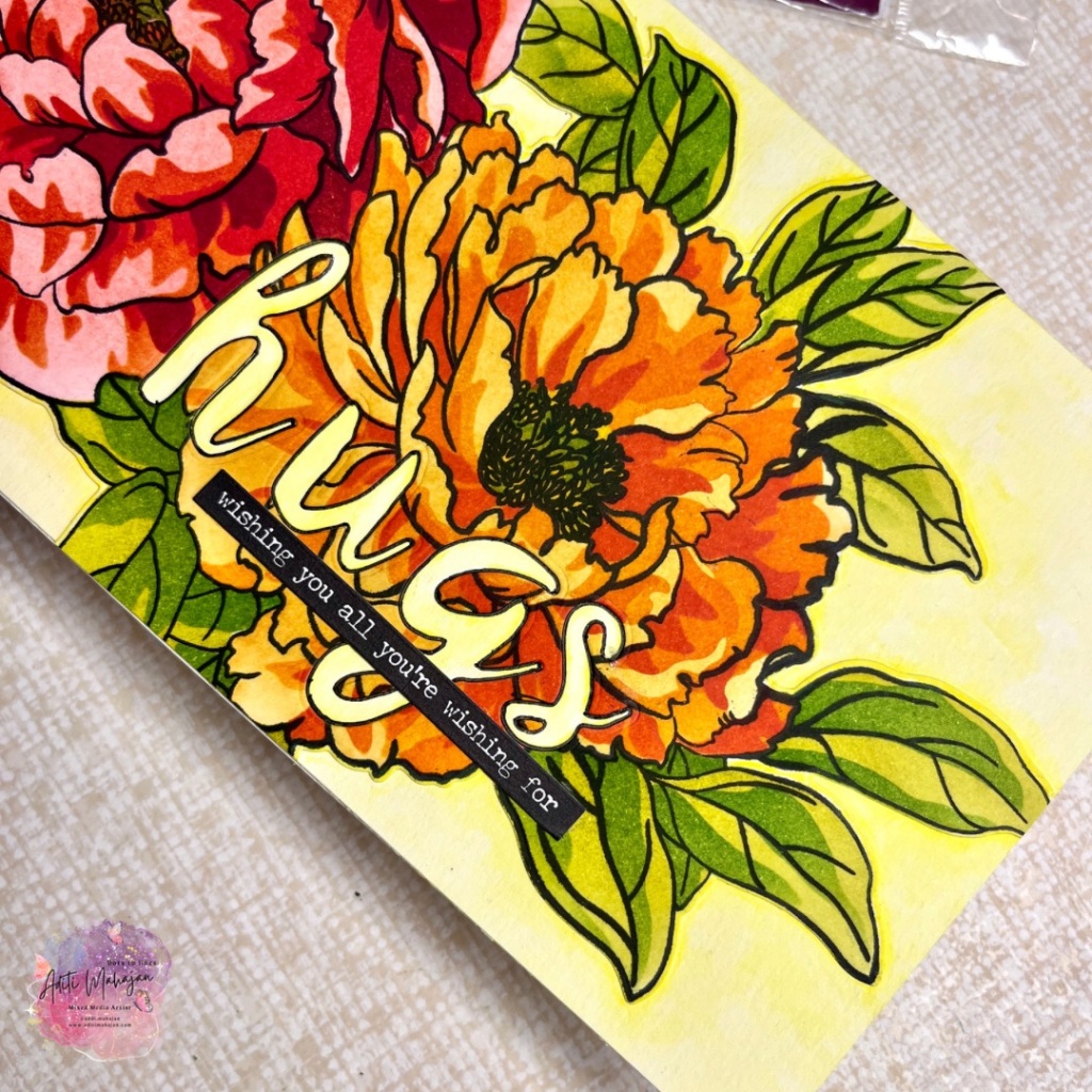
Colour is what attracted me to art. Over the years, I’ve extensively studied the effects of colour on mood. Being a psychologist and then artist, I wanted to use colour in therapy. The AECP 2 class, In the Mood for Colour has been amazing with respect to my interest in colour therapy. Choosing colours based on mood and feelings, or choosing colours based on what you’d like the recipient of the art work to feel, is something I tapped into deeper in this class.
Based on the lessons, I decided to create a vibrant card. I have used warm colours- yellow, orange and red with the idea to create a mixed energy of happiness, optimism, love and cheer. My sentiment reflects this same energy with the colours.
I’ve created a slimline style card. using the Billowing Peonies large flower and coloured it with coordinating stencils. I’ve added soft yellow water colouring to the background, spotlight the flowers. I’ve used the inlaid die cut technique for the main sentiment- hugs. This sure makes me smile, happy and energetic.
The colours create a positive vibration and spread cheer. I do hope you feel that energy looking at this card as well.
Today is a new day, and it is full of possibilities. It’s upto us, what we choose and what we make of it.
Here’s an art journal page I created inspired by Altenew’s February challenge. I was inspired by the colours, and the clouds in the photo. I’ve picked pattern paper from Altenew’s oldest collections that give me the shades of pink along with the white mist to mimic clouds. I’ve added floral clusters as focal elements and completed my page with splatters, enamel dots and a phrase. For the flower I’ve used shades of pink, and for the leaves I’ve used jet black ink with a generational stamping technique to achieve that shading, keeping the black balance from the photo in mind for the page.
Alex Syberia designs is celebrating their new release products with a blog hop! We have a fantastic line up of artists who’re inspiring you’ll with their fabulous makes.
I’ve created a journal page in my square watercolour journal using the Spring Garden Set. I’ve used the watercolour technique to colour heat embossed flowers on the background. I’ve used the coordinated stencil to create a cluster for the focal elements and completed the page with sentiments from the same collection.
Here’s a look at the page.
Giveaway info:
Alex Syberia Designs is giving away the full release bundle, valued at £280 ($340) in total, and giving away a £15 gift card to 2 lucky winners!